
According to a Nielsen report, almost 90% of smartphone users their mobile devices to browse the Internet at least once a day, and almost 35% spend more than 3 hours on their phones in a single day. What’s more, Google is noticeably favoring websites that have mobile versions compared to websites without mobile versions, as non-mobile websites do not respond well when viewed on a smartphone screen.
Thus, if you are looking to purchase a website, make sure that it has a mobile version. Here are six qualities that you need to look for in a mobile website, from having a great user interface to have a valid eCommerce insurance certificate.
Table of Contents
1. Responsive and Universal Website Design
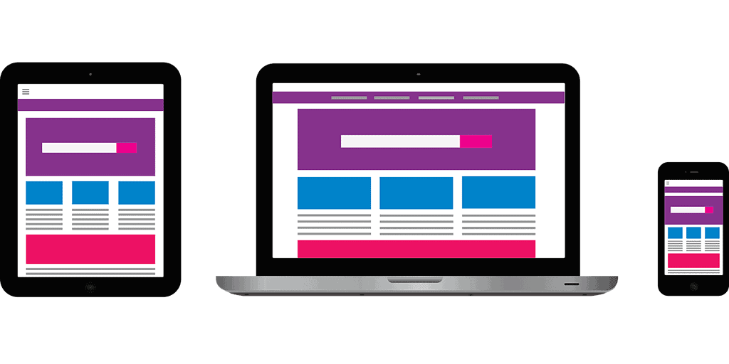
When it comes to mobile websites, there are two things that you need to keep in mind. First, users will be visiting a website using a wide variety of different devices. Some people are using their smartphones, while others are using tablets. Some are even using smart TVs! Second, these people are most likely using the same devices to visit the site over and over. Thus, you must make sure that the website you will purchase delivers a consistent and fast user experience no matter what device they are using. The words and images must be clear, the loading times must be quick, and the links must work consistently.
2. Visible and Noticeable Call-To-Action (CTA)
One of the most important parts of any website is the call-to-action (CTA). Basically, it’s the part of your website that encourages your visitors towards the outcome that you want. A CTA can be a call to purchase your products, to signing up for your mailing list, or even something as simple as liking and sharing your content. Having a clear CTA on a website shows a direct correlation to higher conversion rates.
For mobile websites, you should see the CTA no matter how limited the possible viewing screen might be. Smartphones, for example, have a very small screen compared to a desktop or a laptop. Thus, the CTA must always be visible and clear.

3. eCommerce Insurance
This might not be quickly obvious, but you must make sure that any mobile website has eCommerce insurance! Keep in mind that a high number of eCommerce customers do their transactions on their smartphones, so you must always be ready for any possible liabilities that can arise from these transactions.
The easiest way to determine whether a particular mobile website has eCommerce insurance is by checking the terms and conditions. All the terms of the insurance are usually listed in the terms and conditions of a website, and if it is a legitimate insurance policy, these terms and conditions will be clearly listed so that users and visitors can easily see and understand them.
4. Easy Navigation
One of the most frustrating parts of the mobile browsing experience is when a website has a difficult navigation interface. The links are usually too small and difficult to press, and it’s easy for users to click on the wrong links. In fact, the frustrating navigational experience is one of the top reasons why people quickly leave a mobile website, resulting in a high bounce rate.
The links should have apt spacing and be easily visible even on limited screens.

5. Easy to Fill Forms
The most important tool for any mobile eCommerce website is a form that’s easy to locate, read, and fill out. Remember, people who use mobile browsing are usually on the go and have limited time, so these forms must be short. Only the most important information should be required on these forms so that users can easily see how many steps they need to take to finish filling out the forms.
At the very least, you should only ask for the visitor’s name and email address, and if possible, have some form of autofill program to make the filling out process quick and stress-free.
6. Convenient Contact Information
For mobile websites, the best way to contact the owner would be to have click-to-call functionality. This makes it very easy for users to contact your company with just one tap, and it even eliminates the need to fill out a contact form.
According to a study by Telmetrics, click-to-call functionality is so essential that more than 60% of users consider it one of the most important aspects of any mobile website. What’s more, users who experience a quick and responsive click-to-call function on a mobile website is more likely to call again in the future.

