
Updated on
Mobile phones now dominate web traffic, making up 61.5% of visits. If your WordPress site isn’t responsive, you might be turning away potential clients without realizing it.
If your WordPress site isn’t entirely responsive, you may miss out on many potential clients. Smartphone users anticipate easy navigation, fast loading times, and an easy interface; if these aren’t met, their focus will be quickly lost, and they will easily take business elsewhere.
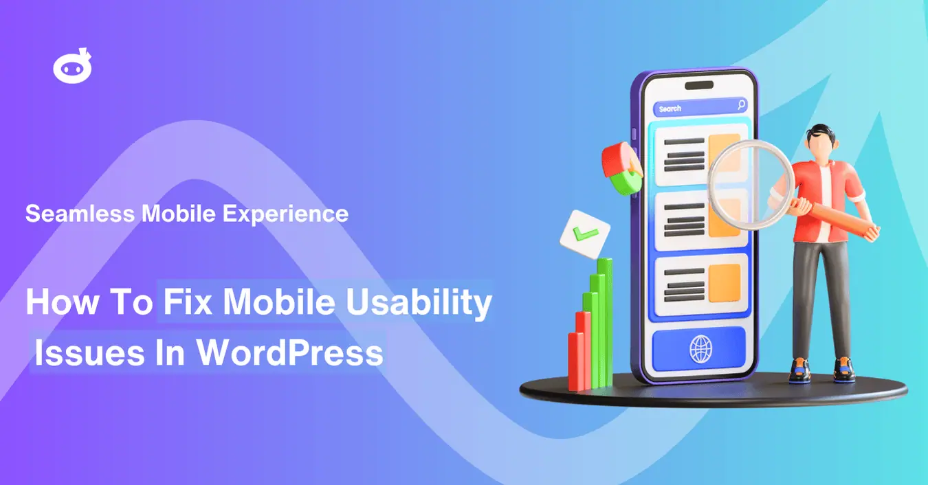
This article will guide you on how to fix mobile usability issues in WordPress to make your WordPress website more mobile-friendly and improve the experience of your mobile visitors. Whether you’re new to this or an expert wanting to enhance your website, you’ll find practical, easy-to-follow tips here.
Contents
- 1 What is Mobile Usability, and Why Does it Matter for WordPress Websites?
- 2 Common Mobile Usability Issues in WordPress Websites Responsiveness
- 3 Touchscreen Navigation Problems
- 4 How To Fix Mobile Usability Issues In WordPress
- 5 Tools and Plugins for Enhancing Mobile User Experience
- 6 Measuring and Monitoring Mobile Usability Errors on WordPress
- 7 The Business Benefits of Improving Mobile Usability Optimization Using WordPress:
What is Mobile Usability, and Why Does it Matter for WordPress Websites?
Mobile usability involves making sure that websites are created to be easily navigable and effective on mobile devices, particularly if you’re looking to learn how to fix mobile usability issues in WordPress. For WordPress sites, this involves enhancing the design, layout, and mobile performance to ensure users can easily navigate and engage on smaller displays.
- User Experience: Poor mobile usability gives a bad user experience; thus, there is a chance that users will abandon that site.
- SEO Rankings: Mobile usability directly impacts the Search engine optimization of a particular site, as it would be hard for them to rank a site that lacks sufficient optimization for mobile phones.
→ Google’s Mobile-First Indexing
With Google’s mobile-first indexing, websites optimized for mobile are given priority in search rankings. This indicates that the mobile responsiveness of WordPress significantly influences your website’s ranking in search engine results.
Performance & Traffic: Assuming this trend holds firm that the newer versions of WordPress prioritize targeting mobile devices, it means the performance of a WordPress site would be determined by its targeted primary users. If a site URL fails to sufficiently optimize its interface for mobile devices, it will face low performance and traffic.
→ The Relationship Between User Experience (UX) and Mobile Usability
There is a direct relationship between mobile usability and the overall user experience. For example, poor mobile usability may lead to higher chances of high bounce rates, lower customer satisfaction, and things of that sort, damaging the reputation of the brand.
Examples of Poor UX:
- Slow loading speeds frequently result in smartphone users leaving the site.
- Content that fails to adjust properly, compelling users to zoom in or scroll without cause.
Enhancing mobile user experience, WordPress makes it simpler for visitors to engage with your site, resulting in increased interaction and retention.
Common Mobile Usability Issues in WordPress Websites Responsiveness
Mobile usability issues can impact your WordPress site’s performance, making it a poor user experience with increased bounce rates and lower search rankings. Here are some of the common issues that may occur:
→ Delayed Loading Times on Mobile
Smartphone users anticipate quick-loading pages, and any lag can negatively impact user engagement. Research indicates that a 1-second increase in load time can result in a 7% decrease in conversions. Slow loading times frequently lead to increased bounce rates and reduced user satisfaction overall.
→ Slow Loading Times on Mobile:
- Big picture files
- Overabundant scripts
- Excessive number of plugins
- Server problems
Enhancing WordPress mobile responsiveness and minimizing load durations is essential for a favorable mobile user experience. To fix mobile errors WordPress concentrates on optimizing images, minimizing CSS/JS files, and utilizing browser caching
Problems such as tiny buttons, unresponsive links, and menus that operate poorly on touchscreens can adversely impact the mobile experience. Smartphone users depend on their fingers for navigation, and a clumsy layout or unresponsive design can be exasperating.
Optimal Techniques for Touchscreen Navigation:
- Utilize large, easily tappable buttons and interactive zones.
- Simple and clear menu layouts that operate effortlessly on touch screens.
- Make sure all navigation components are suitable for touch to prevent unintended clickable elements too close together.
To resolve mobile errors in WordPress, prioritize enhancing touch interactions, particularly for links and buttons.
→ Font Size and Readability
1. Text Size and Legibility:
The clarity of fonts is essential for users on mobile devices. Text that needs zooming or text too small to read can irritate it. Smartphone users anticipate content to be readily legible without needing to modify settings.
2. Optimal Guidelines for Font Size and Legibility:
Employ large font sizes that are readable on smaller displays. Too much or improperly formatted text can adversely affect smartphone users. The mobile responsiveness of WordPress can fix these problems by automatically adjusting font sizes and formatting.
→ Pop-ups and Ads on Mobile
Intrusive pop-ups and advertisements can greatly interrupt the mobile user experience by obscuring content, delaying load times, or creating confusion.
Solutions for Mobile Pop-ups and Ads:
- Utilize well-timed pop-ups that show up at unobtrusive times, like after the user has scrolled down.
- Make certain that advertisements are adaptable and fit mobile displays, preventing any hindrance to the content.
Enhancing the mobile user experience on WordPress may involve reducing the frequency of pop-ups or utilizing advertising strategies that are suitable for mobile devices.
→ Broken Links and Content Cutoff
Inadequate scaling or layout problems may result in broken links or truncated content on mobile devices. This may result in a frustrating situation in which users are unable to obtain essential information.
Testing Mobile Views for Broken Links and Content:
- Consistently evaluate your website on various mobile devices to confirm that all links function correctly and content is displayed appropriately.
- Employ responsive design techniques to guarantee that text, images, and links stay consistent on mobile displays.
One issue that specifically impacts WordPress sites is when the content exceeds the screen’s width or the viewport is not set. This is commonly known as the Content Wider than Screen issue, where users are forced to scroll horizontally to view the content, which disrupts the mobile experience.
To prevent this, ensure your content adjusts appropriately to fit smaller screen sizes.
How To Fix Mobile Usability Issues In WordPress
If your WordPress site is not doing well on mobile usability, then these techniques below may help provide a seamless and user-friendly experience.
→ Mobile-Responsive WordPress Theme
The first step to solving mobile usability problems in WordPress is choosing a mobile-responsive WordPress theme. A responsive theme automatically modifies its layout to accommodate different screen sizes especially one too small to read, guaranteeing seamless browsing for smartphone users.
Suggestions for Themes Optimized for Mobile:
- Select themes from reputable sources like ThemeForest and StudioPress that offer well-developed, mobile-responsive designs.
- Make sure the theme is marked as “responsive” and comes with mobile optimization ready to use.
- Tailor the theme using the WordPress customizer to modify layout configurations, font dimensions, and mobile-oriented functionalities for the best performance.
Opting for a WordPress theme designed for mobile devices helps your site load quickly and function smoothly
→ Leveraging Caching and Content Delivery Networks (CDNs)
Employing caching and CDNs can significantly enhance the mobile loading speed of your site. Quickness is crucial for sustaining interest, particularly for users on mobile devices.
- Utilizing Caching Add-ons: Utilize caching plugins such as W3 Total Cache or WP Rocket to store static pages and enhance loading speeds for returning users.
- Utilizing CDNs: Employ CDNs like Cloudflare and MaxCDN to deliver content from servers situated nearer to the user, minimizing latency and enhancing the load time on mobile devices.
- Performance Optimization: Instruments such as WP Security Ninja’s performance tools can assist you in detecting and fixing speed bottlenecks that may impact WordPress mobile responsiveness.
These performance improvements will assist you in resolving mobile usability problems in WordPress and guarantee a quicker, more seamless mobile experience.
Utilizing caching and content delivery networks (CDNs) is vital for enhancing mobile usability:
- Caching Plugins: Applications such as W3 Total Cache and WP Rocket enhance loading speeds by saving static copies of your website, lowering server demand, and boosting mobile page load times.
- Content Delivery Networks: CDNs provide content from various servers situated nearer to users, minimizing latency and improving speed for smartphone users.
- Performance Tools from WP Security Ninja: These tools assist in detecting and fixing performance issues, guaranteeing quicker and more seamless user experiences on mobile devices.
Testing Mobile Usability and Debugging Issues
- Once these adjustments are made, it is essential to conduct testing and debugging to guarantee that your site is completely optimized for mobile devices.
- Testing Tools: Utilize Google’s Mobile-Friendly Test, BrowserStack, or Google Chrome Developer Tools to evaluate your website’s performance across various devices.
- Fixing Common Issues: Utilize tools such as Broken Link Checker to find and resolve broken links that could impact your WordPress mobile responsiveness.
- Comprehensive testing and debugging are crucial to resolving mobile usability problems in WordPress, guaranteeing your site functions effectively on all mobile devices.
Tools and Plugins for Enhancing Mobile User Experience
No need to stress over mobile optimization! Making your WordPress site user-friendly for smartphones is simple with the wide range of plugins and tools available. Here are several of the most efficient choices:
→ Mobile Optimization Plugins for WordPress
To address mobile usability problems in WordPress, it is essential to employ mobile optimization plugins that are tailored to the specific requirements of smartphone users.
WPtouch and Jetpack enhance WordPress mobile responsiveness through mobile-friendly themes, automatic image resizing, and optimized galleries, guaranteeing that your site appears appealing and operates smoothly on mobile devices.
By employing these mobile optimization plugins, you can ensure that your site is mobile-friendly, delivering a seamless, adaptive experience for your visitors.
1. Performance Optimization Plugins
Phone users anticipate fast loading speeds, and sluggish websites may result in increased bounce rates. Plugins for performance optimization can assist you in tackling this issue.
- WP Rocket: This robust caching plugin aids in resolving mobile errors in WordPress by minimizing page loading times. WP Rocket reduces HTTP requests, activates browser caching, and compresses file sizes to enhance your site’s performance on mobile devices.
- Autoptimize: Autoptimize enhances your site’s speed by minifying CSS /JS files, optimizing HTML, and enabling caching, which boosts WordPress mobile responsiveness and minimizes mobile loading times.
These performance plugins are crucial for guaranteeing that your mobile site loads swiftly, thereby enhancing the mobile user experience on WordPress.
2. Responsive Design Plugins
Mobile experience greatly benefits from the inclusion of responsive design as part of the process. Thanks to the responsive design plugins, this does not need you to write a single line of code.
- Elementor: Through the use of this building page plugin, creating responsive and accelerated mobile pages becomes easier. It lets users design mobile versions through a simple drag and drop of elements into place.
- WPBakery: WPBakery is another plugin that is a page builder that enables the creation of responsive websites. It also provides the ability to create templates via a visual editor that adapts to various mobile devices to improve mobile user experience WordPress.
These are plugins that enable users to come up with mobile websites without possessing any coding skills thus resolving mobile usability issues on WordPress.
3. Accessibility and Touch-Friendly Plugins
Making sure your WordPress site is accessible and friendly for touch is crucial for smartphone users as well as those with disabilities.
- WP Accessibility: This plugin helps in the support of touch interactions, zoom capabilities, and other features to make mobile sites more usable on WordPress. It’s also an excellent method to guarantee your website meets ADA regulations.
By enhancing accessibility, this plugin increases usability for smartphone users with special requirements, making your website more inclusive and easier to navigate.
4. Pop-up Management Plugins
Although pop-ups can effectively engage users, they need to be optimized for mobile screens to prevent harming the mobile experience.
- OptinMonster: OptinMonster enables you to design responsive, mobile-optimized pop-ups that do not disrupt the mobile user experience. You can establish particular criteria for pop-ups to display, like after reaching a certain scroll depth or when a user completes reading pages.
- Popup Maker: Popup Maker is an additional plugin designed for handling mobile-optimized pop-ups. You can adjust the timing and targeting of pop-ups to make sure they don’t hinder the user’s view or delay page loading on mobile screens.
Utilizing these pop-up management plugins can enhance the mobile responsiveness of WordPress, ensuring a favorable mobile user experience.
Measuring and Monitoring Mobile Usability Errors on WordPress
Optimizing your WordPress site for mobile usability requires ongoing monitoring to ensure a great user experience. With the right tools, you can identify issues and make effective improvements.
→ Using Google Analytics to Monitor Mobile Traffic
Google Analytics and Google Search Console assist in monitoring mobile traffic, bounce rates, and page loading times. This information offers important perspectives on user behavior, emphasizing aspects that require enhancement. Tracking these metrics allows companies to improve their mobile site efficiency and boost the overall user experience.
→ Heatmaps and User Session Recordings
Heatmaps and User Session Recordings: Applications such as Hotjar and Crazy Egg monitor user engagement on mobile sites. Heatmaps identify high-performing regions and detect friction points, allowing for focused enhancements to improve mobile user experience WordPress and effectively resolve usability challenges.
→ Continuous Testing and User Feedback
Frequent testing with resources such as Google’s Mobile-Friendly Test or BrowserStack ensures your site remains optimized, while services like UserTesting offer firsthand feedback from users to tackle mobile-specific challenges, improving mobile user experience on WordPress.
These tools can identify where users encounter issues, providing actionable information to resolve mobile usability errors in the WordPress dashboard.
The Business Benefits of Improving Mobile Usability Optimization Using WordPress:
Improving mobile usability test reports goes beyond providing a superior user experience it also offers quantifiable business advantages that can enhance your profits.
→ Improved Conversion Rates
A seamless mobile experience is essential for enhancing conversion rates, particularly in e-commerce and lead generation. Websites optimized for mobile enhance user experience, allowing for easier purchases or sign-ups. Statistics indicate that responsive websites attain greater conversion rates. With Improved mobile user experience WordPress performance, leading to substantial boosts in sales and business achievement.
→ Better SEO Rankings and Visibility
The usability of mobile devices is essential for search engine rankings. Google’s mobile-first indexing emphasizes sites that are mobile-friendly, enhancing their visibility in search results. A WordPress website optimized for smartphones draws in more organic traffic, improving user experience and increasing sales by expanding audience reach and page visits. This enhances both SEO and user interaction.
→ Customer Satisfaction and Retention
Enhancing mobile performance boosts conversions and customer satisfaction. A seamless mobile experience fosters positive brand perception, encouraging repeat visits and recommendations. Addressing mobile issues improves customer experience, driving retention, loyalty, and repeat business, ultimately strengthening long-term relationships with clients
A Quick Wrap-Up
Mobile usability is a critical factor for WordPress in the current mobile-oriented environment. Selecting a mobile-responsive theme, optimizing images, and testing across different devices, improve mobile user experience WordPress in terms of loading times, navigation, and overall consistency.
To enhance and test your WordPress mobile responsiveness, utilize suggested tools and plugins, such as WP Security Ninja, which not only protects your site but also aids in performance improvement initiatives. Frequent testing and updates are essential for addressing problems, improving SEO rankings, boosting conversions, and maintaining customer satisfaction.
Begin enhancing your mobile usability now using effective strategies and tools. By focusing on regular assessments and utilizing WP Security Ninja’s strong security capabilities, you can provide an excellent user experience and attain business success.
Get AI-Powered Security Summary
Let AI analyze this WordPress security article and provide actionable insights from WP Security Ninja experts.