A great landing page is equal parts art and science, and it can take a lot of time and effort to get them right. As people consume more and more online content, and as their attention spans get shorter and shorter, it has become more important than ever to catch their attention immediately and hold it as long as humanly possible.
In other words, you don’t have the time to convince them with elaborate copy. Great copy still matters, but it’s the visuals that make that first impression.
Read on to learn five tricks with visuals that will capture your visitors’ attention and boost your WordPress landing page conversions.
Table of Contents
1. Direct Attention towards CTAs
In order to convert, your landing page visitors have to click on the CTA, right? While CTA design is crucial here (and an art in itself), you can use your visuals for little tricks that will help direct the fleeting attention of your visitors where you want it – towards the CTA.
One way is to feature a photo of a person who is looking or (more or less directly) pointing towards the CTA. By far, the most commonly cited example of this is the famous heat map baby that looks at the copy and dramatically increases the attention that the copy gets when compared to that same baby looking towards us.

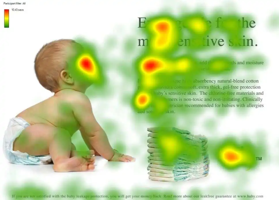
Source: neurosciencemarketing.com
Sometimes it will be as simple as having arrows pointing to the CTA, which can also be surprisingly effective.
There is actually a ton of scientific research into this kind of direction of attention.
Other times, it can be more subtle, using visual elements to surround the CTA, making it indirectly more attention-grabbing, like in this example from Elemental Labs. The color of the hero image makes the white CTA stand out, and the other elements surround it, making it really visible. The packet on the right even points towards the CTA.
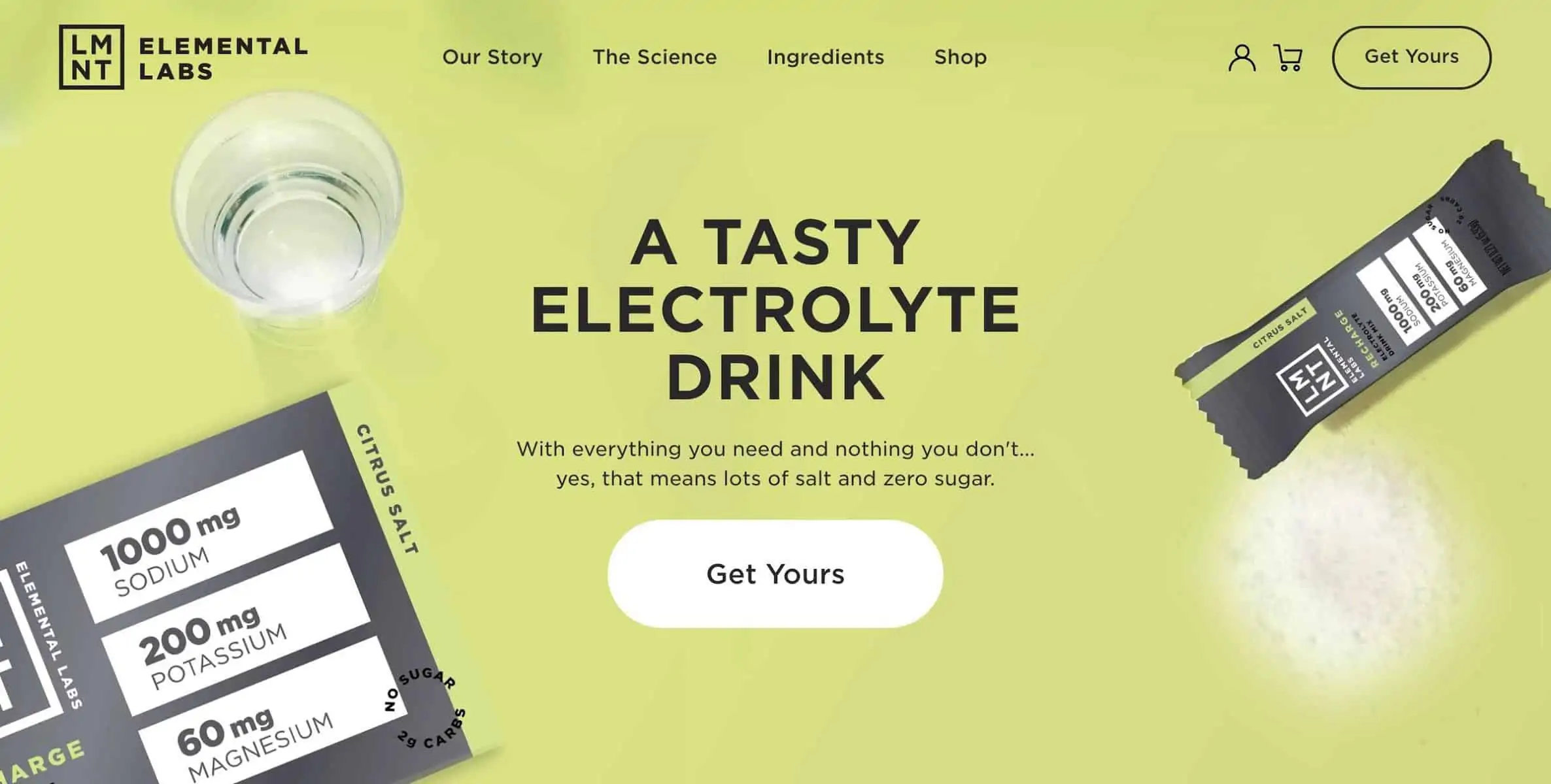
Source: drinklmnt.com
They also get extra points for featuring quality images of their product.
2. Go Conceptual
The folks from Elemental Labs got additional points for their use of actual product photos, but this is not necessarily always the absolute best idea. Sometimes, you can go conceptual to illustrate certain ideas behind your brand and the product/service you are selling.
It’s like the ultra old-school concept in traditional advertising, where luxury items such as jewelry, performance cars, and even perfumes are presented in a way that screams opulence and exclusivity, sometimes without even showing the product.
The idea is that potential customers associate a certain concept or emotion with your product.
You can achieve the same subconscious effect with your landing page visuals. The key here is to find a simple but effective way to convey a certain emotion or idea. For example, Aura, a machine-learning-based repricing tool for Amazon, lets you know how advanced and futuristic their solution is by featuring a background video of an astronaut as a hero “image.”
 Source: goaura.com
You have to be careful here, though. Sometimes you can go too conceptual with your visuals and people may completely misunderstand your message. Another pitfall to avoid is going too obvious, causing eye-rolls all around.
3. Videos, videos, videos
While the Era of Video has not exactly gone as planned (or as some claimed it would, *cough*Facebook*cough*), there’s definitely more than enough justification to include videos on your landing pages.
For one, videos can explain how your product works more succinctly and effectively than the best copy can. For software products, this will usually feature a screen capture of the app being used, showing off what it can do. For physical products, the best way to go is by showing people using the product in real life.
Explainer videos are also a great way to present your product, especially if you have the resources and/or the know-how to do them a bit differently, like Vonage, for example.
You can also use background video to produce a certain atmosphere or strengthen your message. For example, the Riello Sistemi website features a background video on their website that reinforces your trust in them by showing their team working on a rotary transfer machine.
![]() Source: riellosistemi.it
Source: riellosistemi.it
(In the interest of full transparency, I don’t know what rotary transfer machines are, but if I did and was looking for one, this background video would definitely sway me in their direction.)
In essence, videos can be a huge boost for your landing pages, and there’s no shortage of ways to include them on WordPress websites.
4. Make Illustrations Context-Appropriate
With the proliferation of Canva, Blush, and similar services, it’s become affordable and easy to come up with great-looking websites that don’t cost an arm and a leg. Consequently, many WordPress websites feature illustrations these days.
Unfortunately, these illustrations have become so popular that people are using them every chance they get, often without realizing that the context is simply not the appropriate one for using such illustrations.
This is especially true for the Blush-type illustrations which have taken over the web in the last few years. And there’s nothing wrong with them, don’t get me wrong. They will be a perfectly fine choice for many websites.
Not for all, though.
For example, using a quirky, hand-drawn illustration may not be the best choice for brands that offer corporate services or something serious like that. The context is not the right one, and the impression is all wrong. In other words, illustrations need to serve a clear purpose and support the brand message.
Eachnight does this very well with their super-simple illustration that fits the brand, immediately gets you in the mood for a good night’s sleep, and tells you that they’re about to compare the best mattresses you can buy.
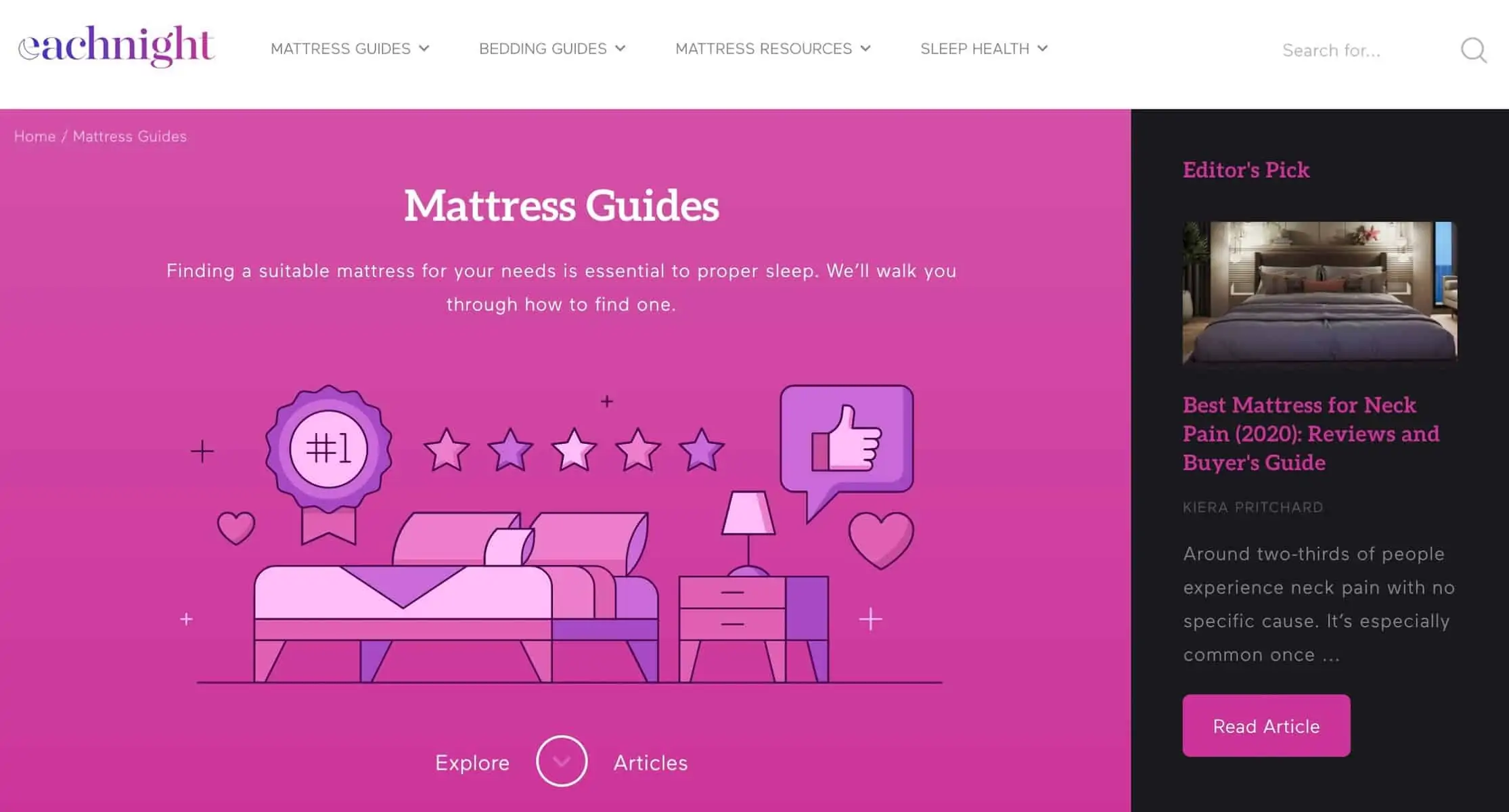 Source: eachnight.com
5. Turn Your Testimonials Visual
It’s no secret that testimonials can make or break an online business. In some industries, they’re the most important factor when it comes to conversion, and even in those where they’re not crucial, they can still play a huge role. For WordPress sites, it’s super easy to include testimonials, thanks to a wide range of available plugins.
One of the best ways to make sure your customers’ testimonials are even more effective is to make them stand out visually.
The easiest way to do this is to include the photo of a person who left a review or wrote a testimonial. This makes the testimonial far more believable and personal by putting a face to the words. Most plugins will enable your customers to do this when they leave their testimonial, but some people may feel uneasy. This is where some good old-fashioned customer communication will come in handy.
If you want to take this to another level, you can even create video testimonials with your most loyal customers. You can find some great stats and examples of this in this amazing article.
Here is a great example from Freshbooks: https://www.youtube.com/watch?v=bZEvZKtJlwQ
Don’t be fooled – it takes some effort, especially if you want sleek, richly produced testimonials. However, in most cases, you won’t need them. In fact, a bit of homemade magic can go a long way toward trustworthiness.
Closing Word
Landing page visuals are not just there to fill space. They can help you convince your visitors that your product or service is the right one for them. Sometimes, it will be directly, and other times, indirectly. But they can definitely help.